
 Bigger size under the read more.
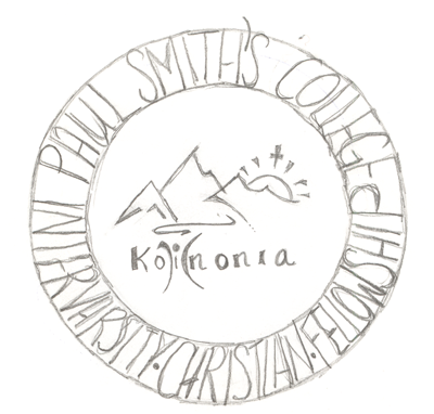
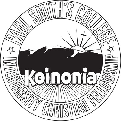
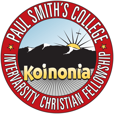
They provided the sketch (below) and I reworked it to be a bit more legible, to match the mountains to the actual Adirondacks and to give the name (Koinonia) some presence. They wanted something that they could use in various formats; thus explaining why the black and white type is outlined instead of just solid black. If you note the sample color version, it gives them some room to play. I originally wanted to keep the cool work they did with the “i” but they explained that they borrowed it from a logo they saw on the web. So instead I did some subtle work to the i’s to make them like little people looking up at the rising sun.
4 responses to “Recent Design: Koinonia Logo”
Very nice design Rey… but I always knew you were good at what you do. ;)
I like seeing the process, from client sketch to designer execution, and a hot execution at that. You’ve been getting to do a lot of nice stuff lately…
Thanks guys. I keep meaning to post some of the design work but I keep forgeting.
Just catching up on your blog:) We love the logo! Thanks man