It’s that time of the season when the cherry blossoms are in bloom; the cardinals are frolicking with the robins; when the morning dew mingles with the morning showers; and where presidential hopefuls start putting their foot forward. Ah, can you smell feel it?
That’s right, we’re past the mid-term mark and political muscles are flexing while Presidential hopefuls aim at glomming onto any issue.
But in this virtual world, we find that although politics moves fast, image moves faster. And nothing moves your image like a web site, money, networking and a tight-brand: something that politicians before President Barack Obama didn’t really do successfully.
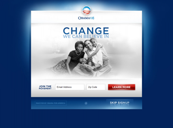
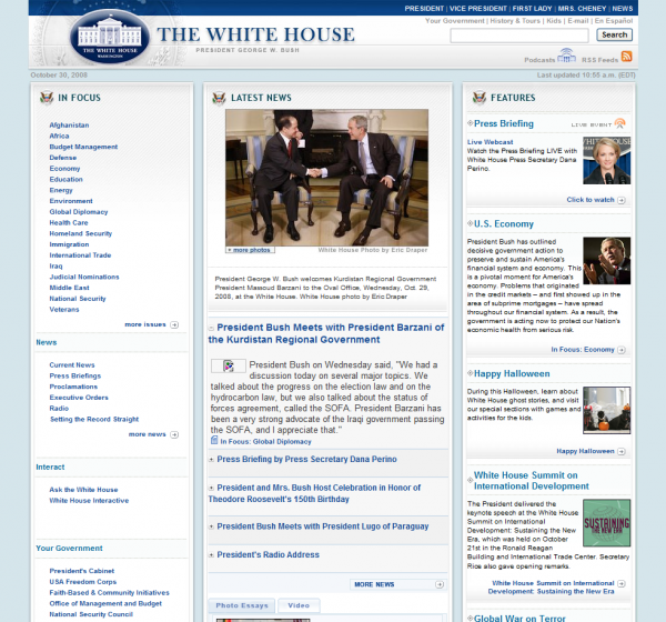
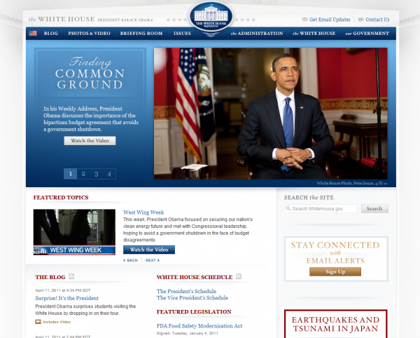
The President is in the lead with the Dream Design Team. They maintained some of the same elements from the previous incarnation. The genius “O” logo is still prominent. The simplicity is still there. But they also did something very subtle. The design elements from Barack Obama’s original site was carried over into the White House giving the site a gorgeous look. Previous administrations were big on giving as much information as possible on the White House page.
The new design team realized that the problem wasn’t that they had too much content to organize, it was that they had to simplify how it was being received. That they did with the same style of the original campaign site.
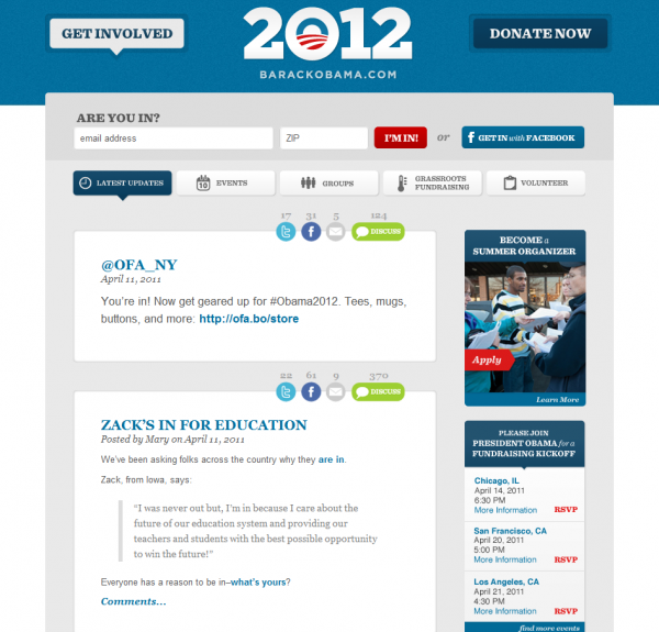
The President’s new site is not repeating all of the same design elements. It’s gotten even simpler. Social networking tools that worked for him n the past are in the fore. The call to actions are both prominently placed by yet another genius logo (2O12) . Just about every icon is explained but without being fussy. A solid site.
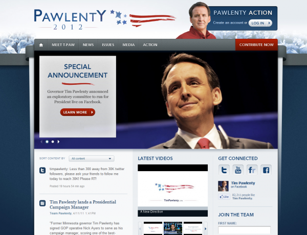
Tim Pawlenty launched his site and it is also tight. The design team here isn’t trying to copy anyone beyond current web practice with a nicely organized and prettified site. The call to action is prominently located beneath the Log-In button (upper right hand corner is primo real estate) and the slider makes a point of constantly calling the reader to Learn More. It is a site that declares the campaign hopes with fists flailing.
Enter Mitt Romney. When seeing Pawlenty’s site, I can’t help remembering Romney’s ’07 design. Romney, bravely facing the charge, information all prominent, American flag waving. It was so TA-DA! I WAS MADE TO BE YOUR PRESIDENT! It was also overload. The guy wanted to say so much that we couldn’t really see what he was saying. He didn’t learn the lesson of the better designed sites (like McCain’s and Obama’s) which focused on talking points and call to actions.
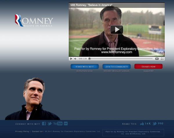
The new Romney site is different from all of these while being very much the same. It recalls the simplistic elements of the Obama team—which comes off horrendously. It tries to incorporate the American flag and People into the R (recalling the Land-flag of the Obama logo), it uses a familiar tag line and a beloved typeface (which should have been avoided since it was also used by Obama), and it uses similar call to actions in prominent positions.
But it is only a video of a man at a baseball field (recalling the American dream?) asking questions. Instead of flashiness, he’s going with being genuine. This dude has tons of money and could have plastered the site with a hot design but, for an understandable reason, chose something subtle. He wants to try to tap into a wide range of people—dissatisfied Democrats, Tea Partiers, Republicans, and Independents who aren’t committed to either party. Is he successful? Well, design wise, not really. He could have done all that with a better design (definitely something else with the logo) but we can see what he’s aiming at. Romney for the People—not for Republicans. It’s probably why he’s getting nailed on both sides.
In all, I think that Obama still has the best site so far. It’s probably going to stay that way, too. The brand is consistent, the images are clear, the content unobtrusive, and the call to actions are clear: great job Mr. President.
