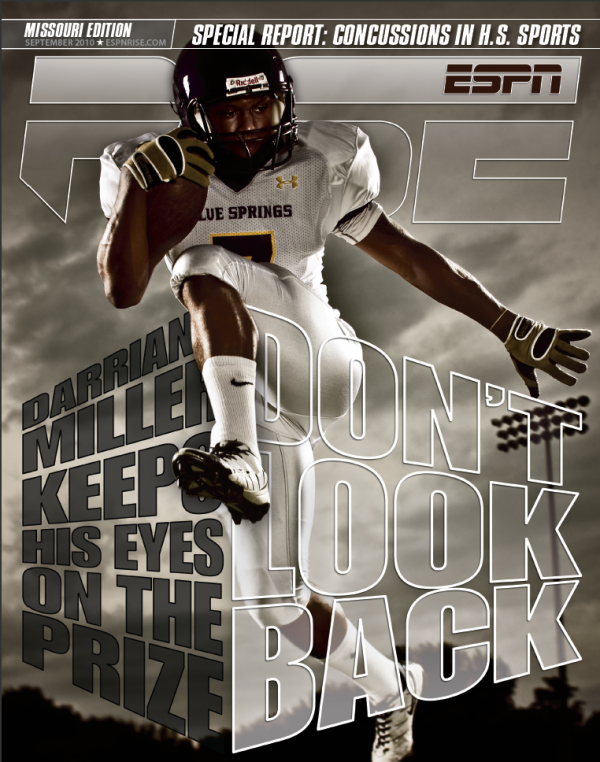
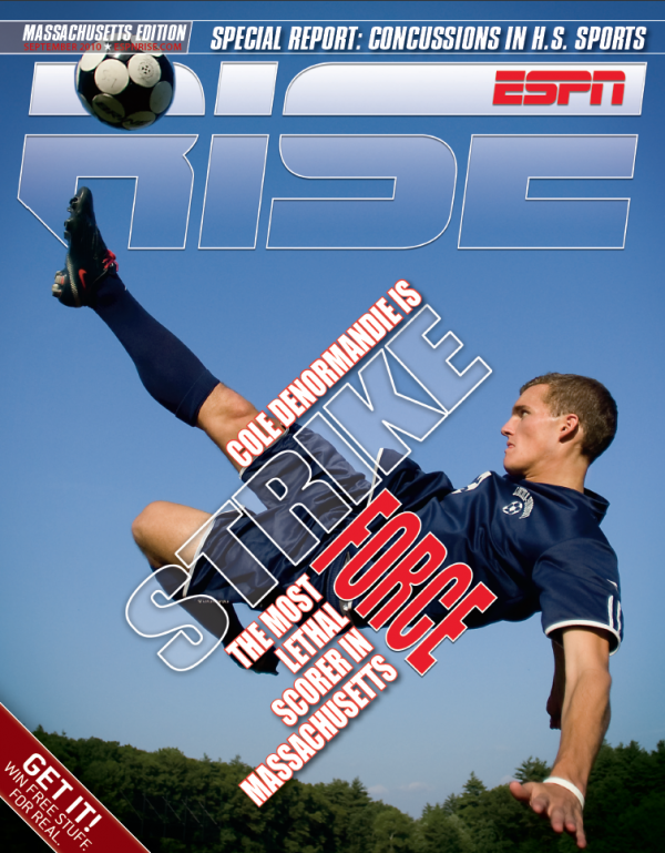
Like an old yenta, a designer is often found matchmaking design projects and fonts. With so many designs, the designer ensures they have access to as many possible matches as possible.
But that doesn’t always work out. After all, the designer, like the yenta, has a certain vision of the ideal font matches. They don’t even think about it; for some reason, a certain font just feels—until you look back and see a matching trend.
So these posts are to display, ogle, applaud, examine and objectify fonts that have crept out of my dreams and onto my designs. Go ahead: fontasize about Impact.


